Hi, I’m Lexi, a New York-based graphic designer exploring the intersections of advocacy, education, and design.
![Inside spread of "The Depths to Which We Sink." Left page is black text on a white background and right page is black text printed on a yellow, orange, and pink risograph image.](https://freight.cargo.site/t/original/i/b54f0bb371d5dd53c0515c720aea88a29ab0f5d3340a16d37a6302ec1cb7b18a/Jilli-bean-4-new.png)
![Lime and blue colored logo variations for "Jilli Bean! Books" printed on the risograph.](https://freight.cargo.site/t/original/i/df2a414f16ce5aa44e1a13834df8d24e9a65e143d05ec1c1e6ab6875a1734daf/Jilli-Bean-7-new.jpg)
![Yellow and red colored logo variations for "Jilli Bean! Books" printed on the risograph.](https://freight.cargo.site/t/original/i/318106ec8929310ded976bad73563d94c1c87c8bf8db07f87cad6607306dce52/Jilli-Bean-6-new-new.png)
![Multiple color variations of a risograph book cover with black text that says, "The Depths to Which We Sink."](https://freight.cargo.site/t/original/i/71be4e872d0b0cd96cde40ede919ac69ef0c0d7cde7ab300852bd56c4ff0770d/jilli-bean-2-new.png)
![Title page of "The Depths to Which We Sink." Left page is a bright yellow with light lime green printing, and the right side is a white with black text and a large drop-cap "T" on a slight angle.](https://freight.cargo.site/t/original/i/a40898bec41e8367c356bf3f7f7b36a871c3b246cb5278b2be1897ed9c15df48/jilli-bean-3-new.png)
![Pink and organge risograph page with capital letters spelling "attention" scattered across the page, visually illustrating the text.](https://freight.cargo.site/t/original/i/1dacd3c8e998d11a914d2cc68c45a466e7f6b6520715d792ef2b8c76054d72d2/Jilli-Bean-5-new-angle.png)
![Print result of vertical oval "Jillian!" stamp with inked carving next to it.](https://freight.cargo.site/t/original/i/a1a049efaf8c7e852c6d256e00207c4616c7c6b0d5353faccfaecba704c58e30/Jilli-Bean-10-new.png)
![Book of the month box with Jilli Bean! Books branding.](https://freight.cargo.site/t/original/i/c59651f76c4be881d7a55e18135e49392c8881e8a1e005b0f88c9472f4ca752c/new-jilli-bean-cover.png)
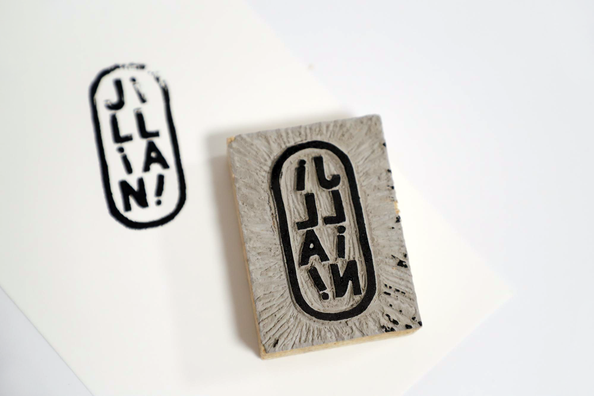
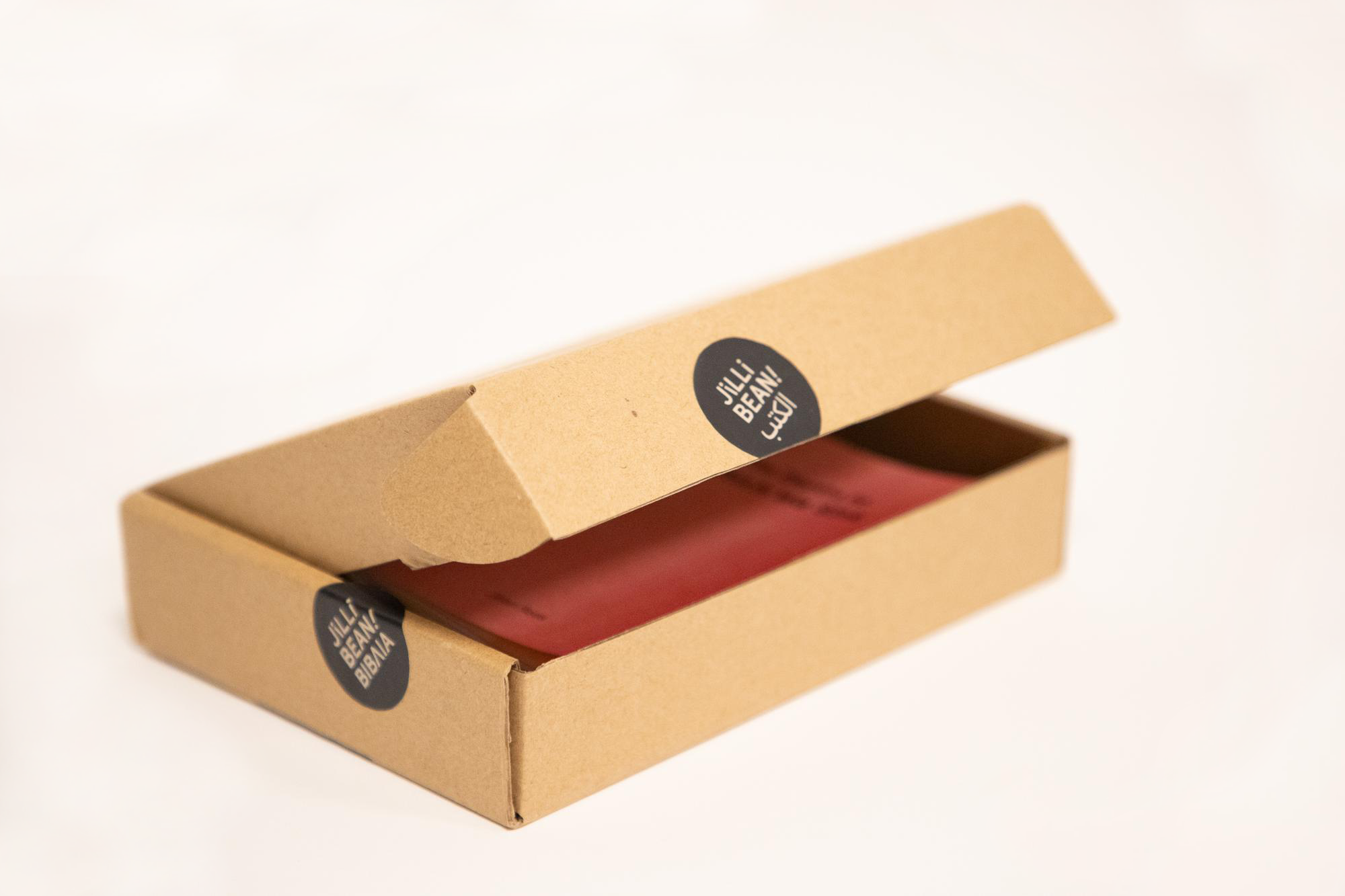
Creating a publishing house, Jilli Bean! Books, to merge the design + writing interests of Jillian Rees.
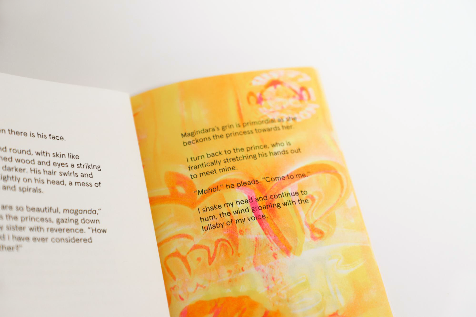
“Here, we’re curious about play with storytelling, design, and languages. Jilli Bean! Books started as a family name passed through childhood. We carry the spirit for curious minds who have creative outlets.
We’re looking for unique perspectives to publish, design questioning and experimenting + adventurous spirits to see worlds collide.”
Brand Positioning + Goals
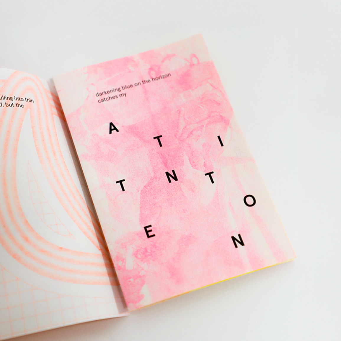
- Playful type with a hint of unexpected
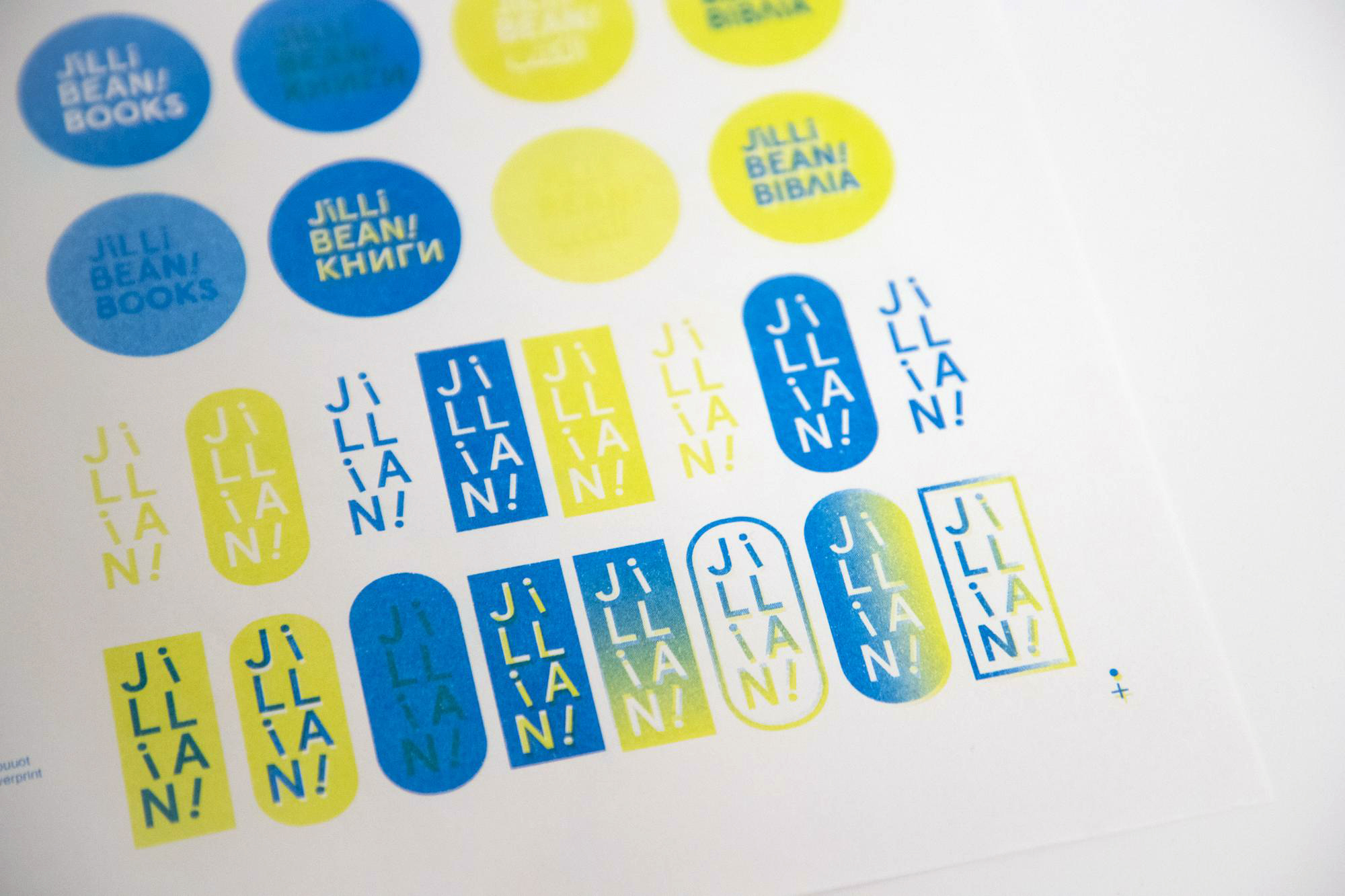
- Create a system that is flexible for multiple languages
- Use composition + color to portray activeness
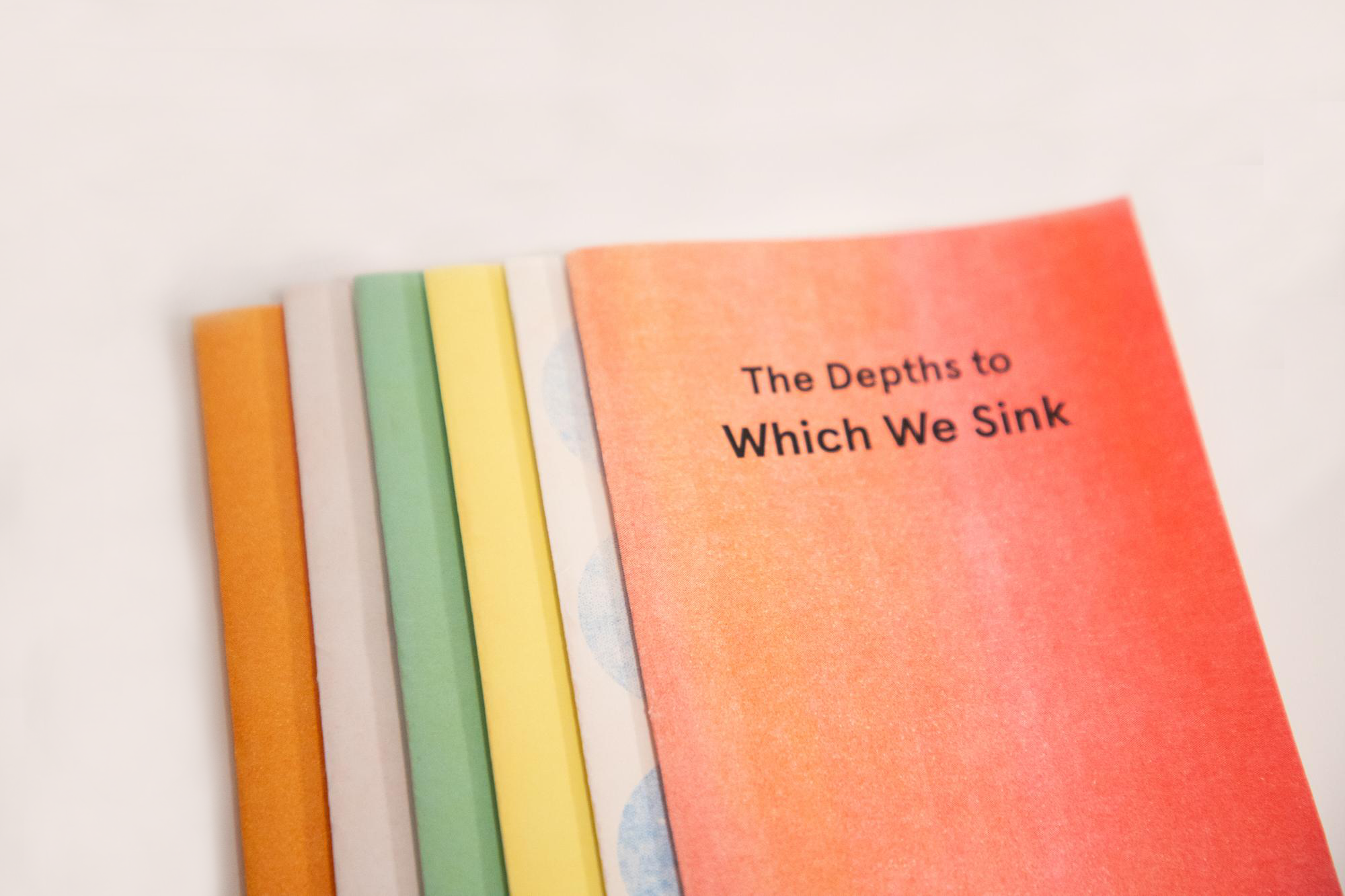
- Explore hand-printing and editions for print applications
- Push how type can be a character
- Connect visual/conceptual dots of writing, language, play + design
︎︎︎ Course: Topics-Branding
︎︎︎ Roles: Graphic Designer
︎︎︎ Collaborators: Jillian Rees (writer)
︎︎︎ Deliverables: Branding Identity, Merch